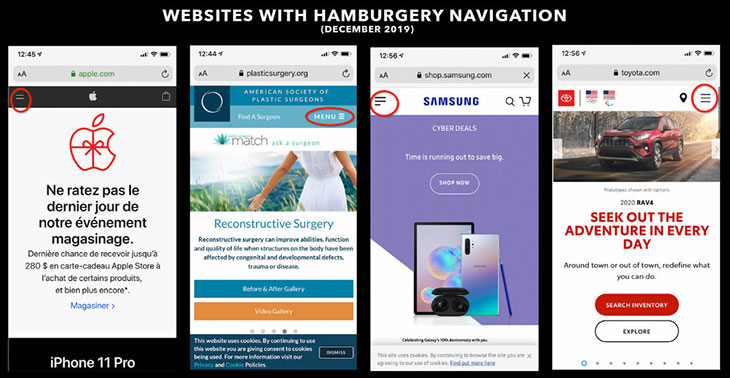
Is it right for your site?
What do hamburgers have to do with your website design? In this case, we’re not talking about the type you get at a fast-food chain. Instead, we’re referencing the infamous hamburger icon used quite ubiquitously now on many websites, browsers, software, and apps.
Whenever we talk about website design, we place the most emphasis on usability (user experience/UX), because it’s the biggest factor in potential patient conversion (from web search to email or phone inquiry made to the practice). If a website is too difficult to navigate, users give up quickly, and the traffic goes to your competition. The hamburger icon has become a simple and instantly recognizable way for web designers to signal to users that there is substantial and important content to be seen.
First, a little bit of history: The designer of the hamburger was Norm Cox, who has been an interaction or user experience design consultant since the early ’80s. It was then that he designed the hamburger icon while he was working for the Xerox Star, which was the first graphical user interface in the world.

The hamburger disappeared for some time after, into the ’90s, only making its reappearance with the rise of mobile devices like smartphones and smaller screen sizes. Because designers had much less screen real estate to work with, they had to find a way to fit all the menu choices available into just a few inches. The hamburger was noted as a good option, and it was soon being adopted by apps like Facebook and Apple mobile interfaces (with the launch of iPhone in 2007). As website design trends became more clean and minimalist, hamburgers also quickly became the most obvious choice for menus on desktop designs.
Then, in 2016, questions arose about whether websites with navigation hidden behind hamburgers were truly easy to use. The Nielsen Norman Group conducted a study into the UX of this navigation, with a small sample group given websites and tasks to complete within a given time. (https://www.nngroup.com/articles/hamburger-menus/). The study found that placing links behind a hamburger (which requires the extra user action of a click before seeing what they are looking for) can hurt a website’s discoverability by nearly 50 percent. However, it’s important to note that this data was largely in relation to desktop versions of responsive websites. Why is that crucial to consider when evaluating whether hamburgers are right for your site? Because in 2019, we’re seeing more than 63 percent of all website traffic to elective medical practices, on average, coming from users on mobile devices, such as phones.
CNBC reports that, by 2025, three-quarters of the world will use just their phones to access the Internet. That’s a jump of 72.6 percent (https://www.cnbc.com/2019/01/24/smartphones- 72percent-of-people-will-use-only-mobile-for-internet-by-2025.html), so website design now needs to be done with a “mobile-first” approach.
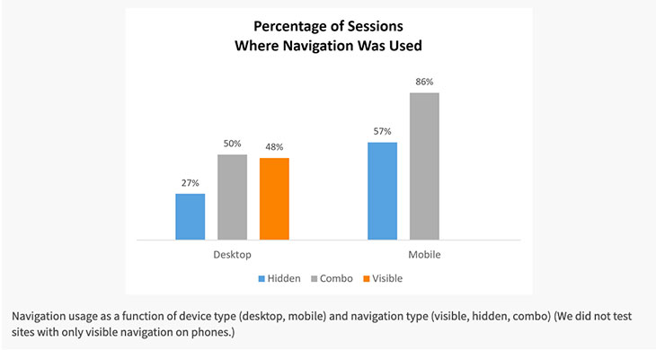
(Desktop: Hidden menus were used in 27 percent of cases. Mobile: Hidden menus were used in 57 percent of the cases.)
Interestingly, it took users less time to use the hidden navigation on a phone than on a desktop, by 5 to 7 seconds. This is important because it speaks to the value of the familiar and also to trends in mobile design.
Internet iconography & user familiarity
According to Jakob’s Law of UX design (named after one of the founders of the Nielsen Norman Group):
“Users spend most of their time on other sites. This means that users prefer your site to work the same way as all the other sites they already know.”

![]()
What that means is that Internet users have been trained over time and experiences online to know that important navigation elements are always going to be available by clicking/tapping the hamburger, because it’s in such wide use. Many UX designers who once felt that the hamburger was a poor choice are now revising those opinions based on the data available in the three to four years since the Nielsen Norman study emerged. A common set of icons and a visual language has quickly emerged online, and familiarity helps users get where they need to be faster.
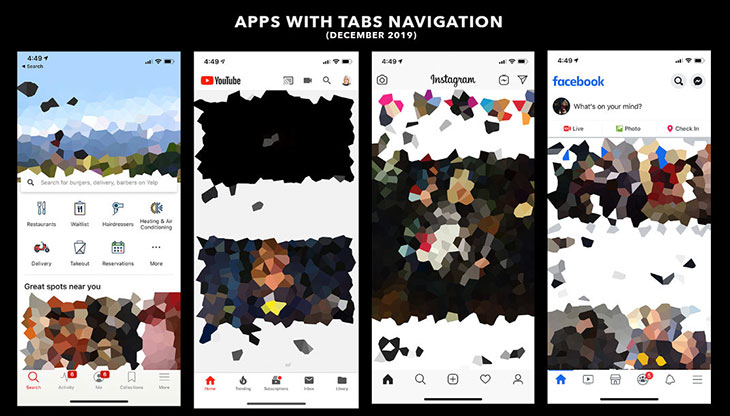
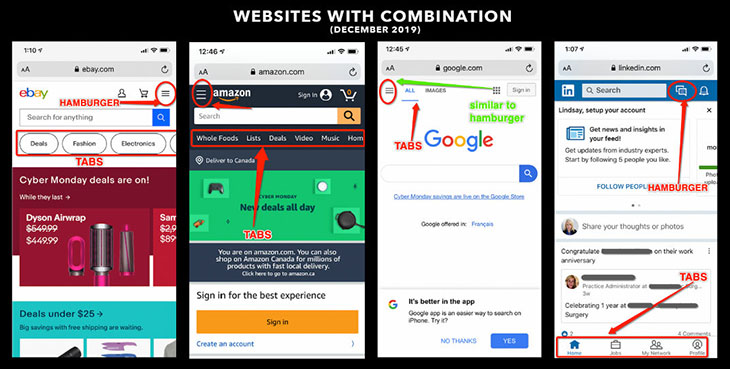
The debate is still heated when it comes to program or app design, specifically, with companies such as Spotify reporting that the removal of the hamburger from their app increased navigation clicks by 30 percent. The popular alternative for app design was to use an icon-based tab system (see examples below), but there’s a big difference between app functions and website navigation. In our industry segment, it would likely prove more confusing to attempt to use icons for non-surgical body contouring vs. surgical body contouring. Taking it further, what icons would a practice use to differentiate BOTOX® vs Restylane®? How could every procedure your practice offers possibly fit into a few icons, and how would they be obvious to all users?
The politics of placement
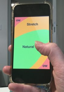
There is also debate over the best placement for the hamburger: right or left. The same argument comes up regarding familiarity vs. ergonomics. Hamburgers appear most commonly on the left, and the thought was that users read left to right, and thus see the symbol faster when on the left. That alignment is also compliant with Google Material Design Guidelines for app design, and therefore users are most used to seeing it left—and expect it there. However, the “ow factor” increases if someone has to physically stretch their fingers (if right-handed) to reach the hamburger, especially as phone screen sizes keep getting bigger and bigger. And so, some websites now have the hamburgers placed in the top right corner.
The take-away
When it comes to desktop web design, it’s been a long-standing joke that hamburger icons, like their edible namesake, are quick and convenient, but bad for you in the long run. But with the market becoming more and more mobile, this might not be the case anymore. There are a few questions you can ask yourself to assess whether or not YOUR website would benefit from the use of the hamburger for navigation:
- How many menu items or pages of great importance do I have?
- What features need to always be quickly and easily available? (Calls to action, phone numbers, addresses, contact us?)
- Is my web content built on the foundation of a conversion strategy? (How well is my content feeding people into the sales funnel?)
Each site and market is unique, so that content, subject matter, design, etc., all factor in as variables that can effect overall sales performance. For example, a study by Conversion XL showed that changing the word MENU to the hamburger icon on an eCommerce site increased sales by 6 percent. Yet another study, this one by ExisWeb, involved changing the hamburger to the word MENU and saw a 12 percent jump in sales.

The truth is that you just won’t know if the hamburger is right for your website until you actually try it in your unique market, with your own content, and compare your conversion metrics with the previous version or against an alternative navigation. Test data is your best friend in the end when it comes to guiding your marketing choices, but making strong moves with your initial design is crucial and should be guided by trends in mobile-user growth going forward.
Pros
- Recognizable
- Faster discoverability on mobile devices
- Quick and direct access to site content
- Keeps things organized and design clean
Cons
- Can make discoverability harder
- Can reduce click-through rates (because it requires the extra click)
- Worse performance on desktop responsive versions of sites than mobile


